Guess what? Your B2C app’s login process is keeping customers from engaging

B2C authentication in the physical world
When Taylor Swift’s Eras tour came through the Dallas area in early 2023, my family trekked from Austin to the stadium to see her performance. On the way in, we not only had to show our tickets, but we also needed to display identification. It was part of the security requirements for the event — due diligence to ensure that the people entering the stadium were supposed to be there and reduce the risk of malicious behavior.
Checking identification (ID) is hardly a new concept. Police check our IDs when stopping drivers for speeding. Bouncers check ID before letting people into bars. Conferences check credentials before allowing registered attendees to enter. And TSA agents check our IDs and boarding passes before they let travelers access the airline gates.
Consumer apps have additional complexity
Digital applications also check ID before allowing access to what’s inside. It’s an essential step to ensure security. But the authentication process doesn’t always go smoothly. It’s not as simple as looking at a physical ID card and comparing the image to the person standing in front of you.
Business to consumer (B2C) apps have authentication systems that typically rely on the user creating an account with a username or password. Then, consumers can log into the app seamlessly… as long as everything goes right.
There are several issues that can make the user’s experience negative. These UX issues can cause obstacles in the user’s journey and trigger frustration. When users are frustrated, they are less likely to engage with the app.
According to a 2017/2018 survey by PWC, 32 percent of customers will stop doing business with a brand they love after just one bad customer experience. But as inflation has increased, customers expect even more today.
Invoca’s 2022 Buyer Experience Report found that 76 percent of respondents were likely to stop doing business with a brand after just one negative customer experience. That means every part of a company’s digital offerings — including the login process — could be a make or break moment.
It’s already hard for consumer apps to retain customers, let alone engage with them. While mobile app abandonment has declined since 2015, it’s still significant. According to Localytics, 21 percent of users download an app and never open it again. Wouldn’t it suck if the content inside your app was incredibly valuable to users, but they didn’t access it because the process was onerous?
So how can you tell if your B2C app authentication process risks losing valuable customers? Short of usability testing and genuine user research, here are five areas to review to see if you need to improve the user’s log in experience.
1. Confusing login process
Ask yourself: Does a user know how to log into your application? Is it clear what account they should use?
Confusing authentication processes tend to be more of an issue for B2B applications than B2C, but they can still exist in the consumer space. Sometimes we encounter this issue when a user has both a personal and a business account with the same company.
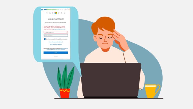
For example, I have both a personal and a business Microsoft account. One account logs into my laptop and one logs in to the software. Fortunately I don’t have to use my username and password very often, but when I do, I have to try and remember which account I use for what and how to set everything up. I’ve definitely found the process of authentication very confusing.
Microsoft is aware of the issues with the process. In fact, they posted an article in the Microsoft Tech community in 2018 about why it’s an issue and why they were working to address it. It’s definitely improved, but still can cause confusion.

Another example is in some banking applications. Users that have both a personal account and a business account may be required to log in with two separate sets of credentials in order to access, because the bank keeps personal accounts separate from business. This can cause confusion for the user.
Let’s not mistake a confusing experience with user friction. In some situations, you want friction in place to slow down a user. For example, because email security is so important, many companies, like Microsoft and Google, slow down users with multi-factor authentication. This can make the login process time-consuming and difficult. But it protects the accounts in case someone is trying to break in.
2. Lack of password or account recovery options
Ask yourself: If a user forgets their password or can’t access their account, can they recover on their own?
In my opinion, there’s nothing worse than me making a stupid mistake. Once I lost our family’s debit card. I didn’t notice it for two days. Fortunately for us, if it had been found, it had not been used. Still, we had to go through a process to cancel the card and order a new one. It took two solid weeks to arrive. Quite painful when that’s your only card and you need to buy groceries.
You’re probably thinking — “forgetting a password to my app isn’t as big of a deal, Cindy.” Maybe not. If your app is important to the user, they might jump through the hoops to figure out how to recover. Just like I did with my debit card. But maybe they won’t.
People forget things — even under the best circumstances. When users forget their passwords, a lack of convenient password recovery options can be frustrating. If the only option is to reset the password via email and the email takes a long time to arrive, it amplifies that frustration.

In cases where users lose access to their accounts because of a forgotten password or a compromised email, be sure to provide other account recovery options that can help users regain access more easily. These include security questions, SMS verification codes, authentication apps, and secondary email addresses.
Providing password and account recovery options supports your users with one of the 10 Usability Heuristics: help users recover from errors.
3. Insufficient error messaging in B2C authentication process
Ask yourself: If a user runs into an error trying to log in, does my app clearly explain what the error was (in plain language) and how to recover from it?
Did I mention users make mistakes? Yep, we sure do. Even when trying to access YOUR app. It could be a bug or it could be that we tried to login in a way that you didn’t want us to. We tend to do things like that.
Take a look at your login error messages.
- Can a user recognize that the message is about an error? Is it displayed in red or bold or something similar that makes it easily noticed?
- Does the error notice clearly explain the problem? Or is it using error codes (which few understand).
- Does the message provide users with a solution so they can help themselves? For example, if the error is about the password, are you providing a shortcut to help them recover the password?
If error messages during the login process are unclear or don’t provide enough information about what went wrong, users may struggle to understand and fix the issue. You can fix this by writing clear and informative error messages to help users troubleshoot problems themselves.
4. Over-reliance on captcha or security measures
Ask yourself: How many of my users are getting stuck at the captcha?
Captcha is a method of checking a user to see if they are human or machine. It comes in many forms. You might need to type in text you see, identify images, or mark a checkbox that you are human.
Maybe I don’t know how to recognize crosswalks, traffic lights or motorcycles, but sometimes when I encounter the ubiquitous captcha popup, it fires off multiple times because I can’t get it right.
Captcha is a low cost way for businesses to protect their products from cyber attacks. But at the same time, it can frustrate users. Hopefully you are measuring how people use your B2C application. If you notice a significant drop off in the login process and you use captcha, you might have a problem.
Conduct an expert review or usability testing to validate this, and then find a balance between security and user convenience.
5. Poorly designed and placed authentication prompts
Ask yourself: Is my user interface providing consistent and clear authentication prompts? Can users find where to log in?
Earlier this week I was shopping on Amazon (it was Prime Day, afterall), but I wasn’t logged in. I didn’t even notice until it was time to check out. Amazon made sure that I went through the login screen before it sent me to the checkout. The process was fairly seamless.
A seamless login is just as important for you. If the placement and design of authentication prompts are confusing or inconsistent across different pages or devices, it can create a disjointed user experience.
Consistency and clear visual cues are important to guide users through the authentication process. For example, you might have a “Login” button in the header so it shows up on every screen.
In summary
If you notice your B2C app isn’t engaging or retaining customers, check to make sure you’re not blocking them at the gate. While security is important, it’s just as important to balance security with a smooth authentication experience. If you don’t you could end up losing as many customers as you gain. Churn can lose you money.
Standard Beagle can help you identify usability issues in your B2C authentication process. Reach out to us to schedule a free consultation to see if we can help.


