Are you not getting the traffic or conversions you think your website should be receiving? There may be things that are deterring users from using your website. Here are our top 5 ways your website might be hindering your success.
Speed
It is no secret that the longer your website takes to load, the more people will leave. Using tools like WebPageTest can help show you, using real data from actual devices, how your site is performing and where to make actionable adjustments.
From the millions of tests performed using our website speed tests, we found that the average load time for a webpage is 3.21 seconds… What we found was that, unsurprisingly, a page’s load time directly impacts bounce rate…. as soon as the page load time surpasses 3 seconds, the bounce rate soars, to 38% by the time it hits 5 seconds!
Pingdom, 2018
Non-responsiveness


There is no reason in 2018 for your website to not be accessible on all major devices, from iPhone to large-screen desktops.
Here are examples from Yale College’s main website and their art school’s website.
See a difference?
Outdated design
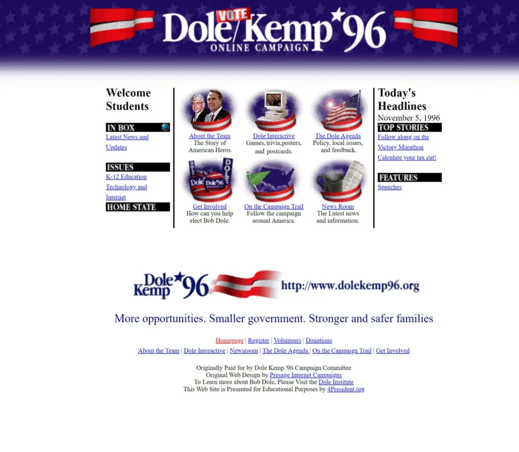
Site visitors will judge your brand strictly off how your website looks. If it looks like it hasn’t been updated since 1996, they are going to distrust your company and it’s offerings.. Your website is an extension of your brand, and it should reflect your company. While there is no definitive timeline of how often you should redesign your website, if it’s been 5 years, it might be time to at least look at your site and see if changes are in order.(yes you can still access the Dole/Kemp campaign page online)
Content is hard to read
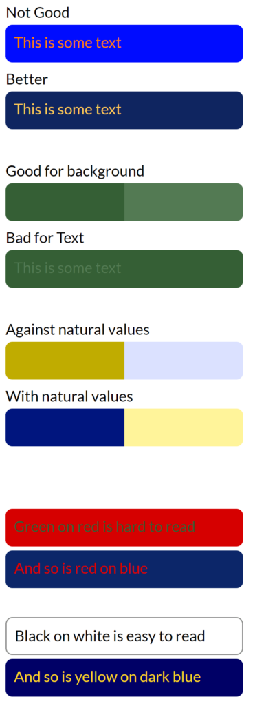
Do you not have enough contrast, or bad fonts? On a website, you generally want to have high contrast between your background and the text color. Black and white are your highest contrast colors, however there are ways to incorporate colors into your design without affecting the readability. For example, if you look at the image to the right you can see how the red on blue is unreadable, however yellow on blue works.
No call to action (or too many options)
Websites should have a defined function that you are asking users to complete. Do you want them to call for an appointment? Do you want them to buy a service? Knowing what you want the user to do is part of the overall design of a site. Look at the University of Advancing Technology website; they have so many different options and features popping up, you may not know where to even start.
These are just a few items that may be causing your users to abandon your website. Have friends or peers take a look at your website and give you candid advice, you may not be able to see what your customers are seeing because you are so well acquainted with your current design. However having a fresh set of eyes can help you determine if a redesign might be in your best interests.