An accessible color palette allows users of all abilities to use software easily and effectively
Accessible color choices are not just a requirement for software, but they are also a vital part of successful B2B SaaS products. While baseline accessibility guidelines are required by law, heightened visibility and application of color theory to a product makes it easier for all users to see and complete tasks quickly.
This guide provides an overview of the process of designing an accessible color palette for B2B SaaS products.
Establish the brand identity
Rather than start with a blank state, you should establishing a brand identity. This will make designing a palette with accessible choices easier. Brand identity defines the product’s core values and messaging users.
The target audience for the product will also determine palette characteristics because of how powerfully color affects human psychology.
For example, software geared towards medical professionals may want to invoke clean, calming, and hopefulness for its target audience. Meanwhile, an app designed to streamline software development may want to seem a cutting-edge, future-forward, and energizing look.
Where to consider accessibility
Color palette choices should do two things:
- Highlight calls to action
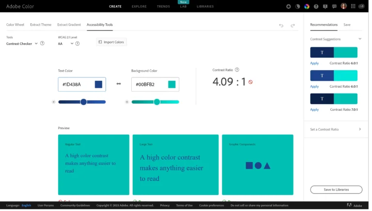
- Pass WCAG 2.2 Level AA to AAA contrast standards
Contrast is one of the more important standards to adhere to, because color blind users will find contrast easier to read.

The W3C recommends a minimum contrast ratio of 4.5:1 for text and 3:1 for larger text (e.g., headings). This ensures that the text is easily readable for users with low vision or color blindness. It is also important to consider the background color when selecting text color. Some background colors may make text difficult to read, even if the contrast ratio meets the minimum standards.
It’s estimated that 20 million people in the United States have visual impairments [article]. While some may rely on technology such as screen readers to navigate digitally, others may benefit from increased readability of the software they use.
Without accessible design, those 20 million people are excluded from either using a product efficiently or using it at all.
Brand identity can be communicated without pushing away potential users.
Choose an accessible color palette
Once you have your brand identity and considered accessibility, it’s time to choose a color palette. Think about the overall user experience and choose colors that fit the software’s purpose.
For example, you should choose shades of blue for a calming atmosphere or bright colors for a playful atmosphere. Your accessible color palette should also be consistent and minimal throughout the software. Too many different colors can overwhelm users.
Here’s another example — an app based in healthcare used by doctors will have a different look and feel from an app used to develop highly technical software. Both benefit from increased visibility to quickly pick out data and their next tasks.
However, one group may appreciate high contrast lists with a familiar blue and white “health” associated colors, while another may appreciate darker backgrounds to prevent eye strain from constant use.
Be mindful of color associations
When choosing the colors for the palette, it’s important to be mindful of the associations that different colors can evoke.
In western cultures, red is associated with passion, anger and danger. Green evokes positive emotions and health.
You should take these associations into account when creating the color palette, because they can influence how users perceive your product. Users most often identify a red button or popup as an alert or warning and green as confirmation. Users can feel confused and encounter friction if you reverse color meanings.
Color associations that we use daily without thinking take advantage of systems that are already in place. These systems — like using a left-pointing arrow in the top-left of a window to go back to a previous page — are so ingrained in everyday use that it takes very little effort on a user’s cognitive load to understand the same arrow in different programs.You can use color associations to make using a product easier to both design and for customers to use.
Test the color palette
Once your accessible color palette has been chosen, the most fool-proof way to ensure that it works as intended is to test.
Feedback from users will uncover how well the color works, or what to improve. It is also important to test the color palette in different environments because colors can appear differently on different devices.
Testers may not necessarily explain their issues are with colors. People may not have the vocabulary to describe what doesn’t work for them. Good questions that may bring to light issues with the color palette are questions about visibility and the look and feel of a screen.
Implement the color palette
The final step is the implementation and continual use of established color patterns. Add colors to a style, component, and brand guide. With guides, future iterations to the product will not deviate from palettes that have been tried and tested.
Designing an accessible color palette for B2B SaaS products is a critical aspect of product design that has far-reaching implications for the target users and their experience. The importance of accessibility in color design stems from the fact that color is a powerful visual cue that can either help or hinder usability. A well-designed color palette can significantly improve the user experience by making the interface more readable, aesthetically appealing, and easier to navigate.
With a successful array of colors, not only will the product entice potential clients to it, but users will be satisfied with having their goals met without having to fight the platform they must use.


