Companies can make an accessible product by thinking about inclusion early on in the design process
Product leaders have been told about the importance of accessible products and want to build them. But it’s more than adding a product on top of a website. It starts with the design itself and considering all the people that might use your product or website.
When a product doesn’t consider all people, it can have negative consequences, ranging from negative press to legal consequences.
An accessible product takes into consideration a larger population that will be able to use and access your website.
Accessible product guidelines
At a minimum, digital products should meet accessibility standards set by Web Content Accessibility Guidelines (WCAG) 2.0. The WCAG guidelines ensure an accessible product by making sure text, colors, media, and navigation are optimized for those who have impairments. What’s more, adhering to accessibility guidelines also benefits people without impairments.
While WCAG guidelines can seem overwhelming, they are comprehensive. Not only should designers understand them, but also product managers, engineers, content strategists and leadership. They are organized under four principles:
- Perceivable – Information should not be invisible to any users.
- Operable – Any user should be able to operate an interface. It doesn’t have to be the same way — the program should have options for users.
- Understandable – Users should be able to understand how to operate the interface.
- Robust – The interface should be able to last as technology advances and be used by a variety of assistive technologies.
3 ways to design accessible products
Designers have three ways to put the user first in a design, which can ultimately lead to an accessible product.
Universal design
Universal design is the core tenant of accessible products. It means designing one solution for everyone, regardless of ability, gender, age, ethnicity or any other factors.
Or in short — it’s design for humans… ALL humans.
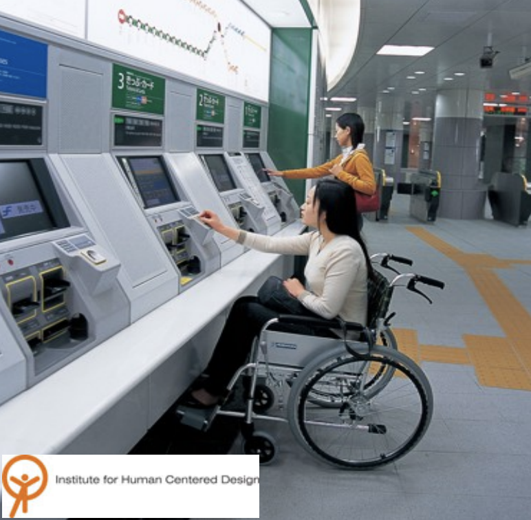
The idea is that the maximum number of people can use the tool. For example: building a ramp to a building that everyone uses, instead of building stairs with a ramp to the side.

Other examples might be designing subway gates wider so that people of all sizes and abilities can move through the gate. Or designing a banking terminal at a lower height so that people of all heights or abilities can use the interface easily.

In all of these examples, the designers created a single design that could be accessed by all people.
In digital products, designers can implement universal design through:
- Text
Text should be easy-to-read, through size and font legibility. Universally, people find larger text sizes and certain fonts easier to read. - Color
Color should have a high enough contrast so that it can be easy to interpret, regardless of ability. That means checking readability of color on backgrounds and ensuring they meet basic accessibility guidelines.
In addition, designers should never use color alone for communicating information because not everyone perceives color the same way. Products should use color in addition to shape, texture or text to communicate information. - Media
Products should make sure that media, including images and video, can be interpreted by everyone, regardless of ability. At a minimum, images should have alternative text and videos should have captions.
Inclusive design
What is inclusive design?
The idea behind inclusive design is: “solve for one, extend to many.”
One of the best examples of inclusive design is the OXO carrot peeler. OXO founder Sam Farber designed OXO peeler with its signature grip when he saw his wife struggle to hold a traditional peeler because of arthritis.

The new peeler was more comfortable for her to hold. But it was also more comfortable for everyone, and the brand took off.

Microsoft says:
Inclusive design is a methodology, born out of digital environments, that enables and draws on the full range of human diversity. Most importantly, this means including and learning from people with a range of perspectives.
Microsoft
Inclusive design recognizes diversity and designs solutions to meet unique challenges faced by different groups.
Equitable design
Equitable or equity-focused design considers both universal and inclusive design and dials it up in order to help people who have been traditionally, historically or systematically excluded. Rather than focused on the solution, it focuses on the outcome. How can users who have been excluded have the same beneficial outcomes using our system?

Equitable design recognizes the unique needs of users and designs experiences so that the users have a similar outcome, rather than a similar solution. A great is example is how mobile devices have different controls that allow users with vision impairments to interact with the interface.
Where do we start for an accessible product?
Recognize exclusion
Humans are incredibly adaptable as a species, and it’s important to make sure our designs also have the ability to adapt to any user that experiences our software or website.
Questions to ask yourself:
- Do your designs rely on heavy audio or visual elements?
- How would a deaf or even a blind person use your site?
- How would a person who didn’t have the use of their hands be able to use your mobile app?
Think about situational exclusions:
- How many times have we been in an area where we could benefit from captions or a transcript of a video?
- Have we traveled to a part of the country and are on 3g wireless connections?
- How would your design be received by even these users?
Drop your personal bias
The more we remember that we are not our audience, the better. This is where user testing becomes absolutely critical.
We developed an app for a healthcare organization and part of the form asked for a home address. What we didn’t realize was that some of the end users would be homeless or in transitional housing.
Fortunately, we uncovered that in user testing. We also learned that some end users were hesitant to even give us this information due to their current situations. We even ran across issues with the touch screen being an issue with people with long fingernails.
These would never have been considered by our team had we not gone to the community and tested our designs with actual users.
Provide control
Allow users to be able to interact with your site how they want to use the internet. Do not disable the ability to zoom, change the contrast, or even the text size. If your design calls for infinite scrolling, consider adding in a “learn more” option for those use the keyboard to navigate because they will never be able to fully use your site.
Did you know some users find parallax design to be nauseating? Give them the ability to stop the scroll.
Give options
Allowing your users to be able to complete the same task, in different ways, can make the experience better. Consider how to swipe, delete, click and edit on a mobile device. This sort of design element allows a user to use the site or software as they are comfortable.
Another idea? Give accessible alternatives. Why hide data tables for infographics just for screen readers? These would be useful to other users as well.
In conclusion
We don’t want to alienate users or make them feel uncomfortable just because we want certain features in our designs. Designs become seamless when we allow our users to interact with the web as they want. Let us take what we have learned from accessible design and expand it to include more than just that small group of users.


