award winning

NKFM Website Redesign

Redesign and development of a new website for the National Kidney Foundation of Michigan
Expertise

, ,

Client

National Kidney Foundation of Michigan

Timeline

10 months

Challenge

The National Kidney Foundation of Michigan needed to redesign its website, so that users could easily find information for programs and offerings.

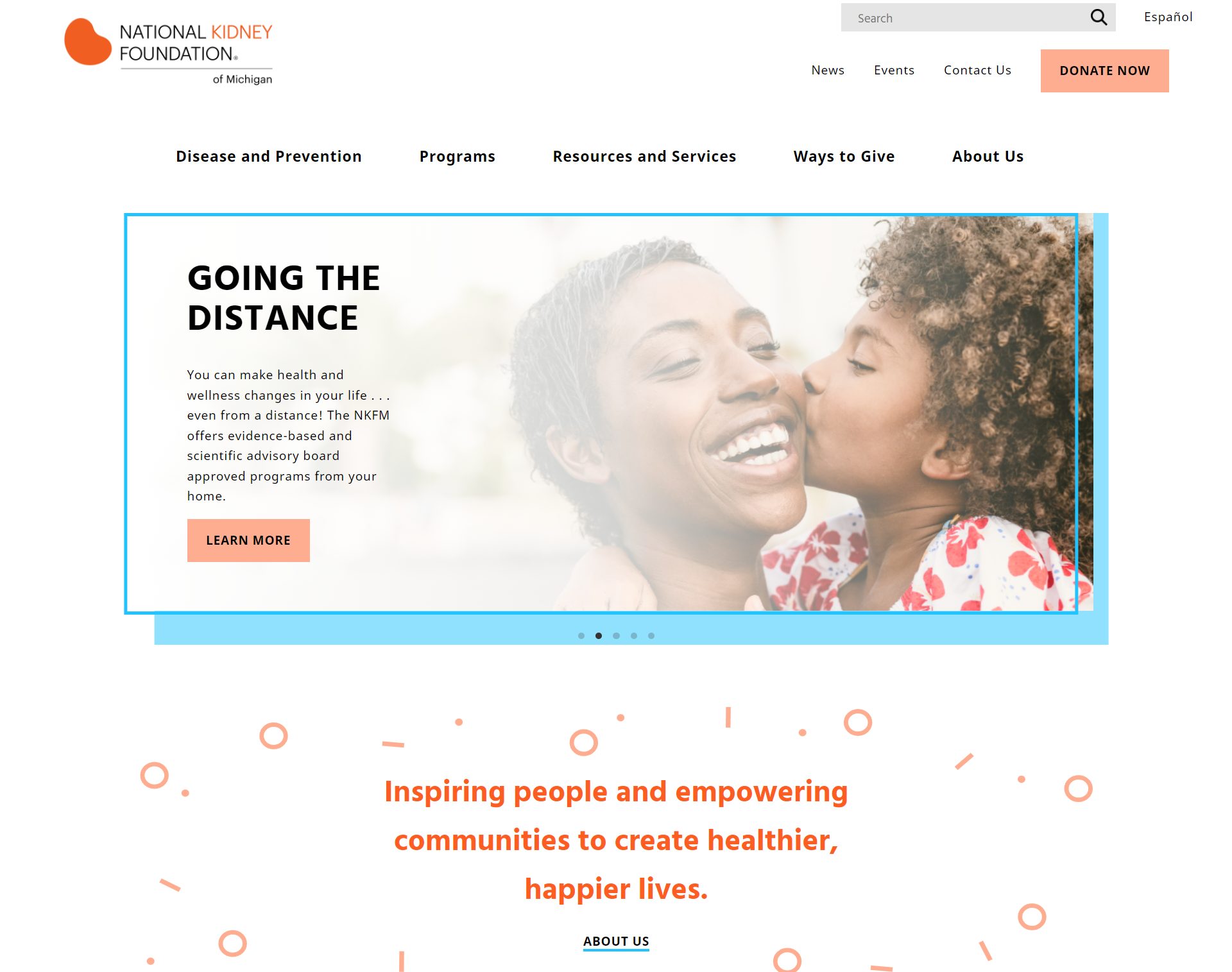
The NKFM wanted to create a better experience for people to learn more about kidney disease and for people to donate to the organization. While all the information was already available on the website, the NKFM worried that users had trouble finding the necessary information.

The NKFM also wanted to update the design and content for easier reading and bring aesthetics up-to-date.

How might we recreate a website that guides users to its most important information in a pleasing way?

Scope

The scope for this redesign included a full UX evaluation, a new style guide and navigation, and built custom layouts for a WordPress theme built on Genesis.

Constraints

Our timeframe for the project was from May 2021 to March 2022. Our custom designs included up to 7 wireframes and a clickable prototype, and up to 5 coded templates.

Implementation

Using our research as a basis for our designs, we implemented a mobile version of the website and a restructuring of the information architecture.

Our Goal

Our team at Standard Beagle used UX research and UI design to redesign the website, while our web development team brought it to life.

Goals

  • Find the blocks to vital information on the current website.
  • Get a clear picture of the user personas the client was missing.
  • Reorganize navigation and website infrastructure.
  • Build a website based on a new style guide and layout.

Our Solution

We recommended research based redesign to create a streamlined experience for the users determined by the user personas.

We recommended reconstructing the information architecture, along with a design update, will help direct users to their end goals. Research included a heuristic evaluation, an information architecture audit, and user testing on the original website.
Results

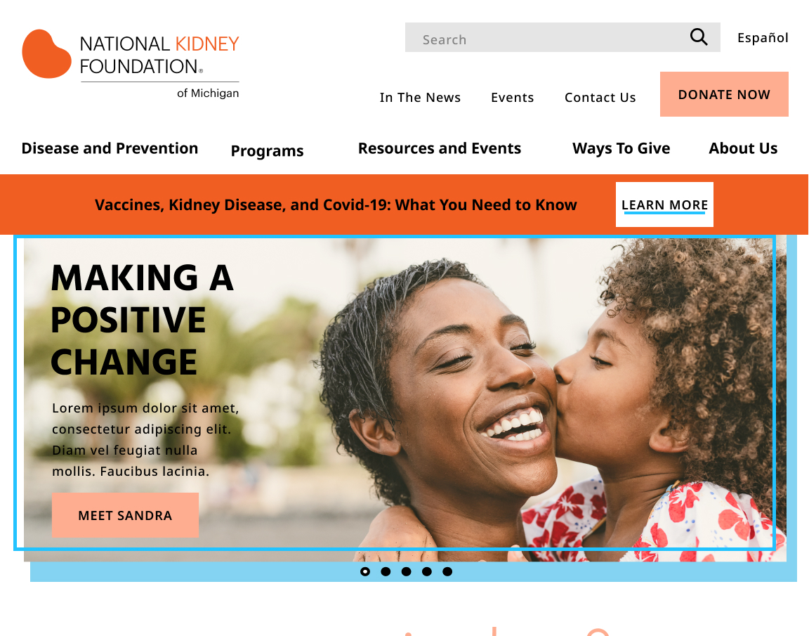
Ultimately, we provided a clear picture of the user personas, restructured navigation to make finding important information easier, and created a website that would entice and delight users upon entering.

This website redesign has won multiple awards

Awards

2022

Non-Profit

Hermes Award: Gold Tier

2022

Health Website

Web Excellence Award

Our Process

Understand

We decided to start with assessing the state of the current website.

Heuristic Evaluation

Our initial steps started with evaluating the current website. We did a full analysis using Jakob Nielsen’s usability heuristics. Our analysis showed areas of improvement on the website, which we took into account for the redesign.

  • Highlighting key user flows with clear calls to action to prioritize the primary user persona goals
  • Increase color contrast to make elements, actions, and options more visible
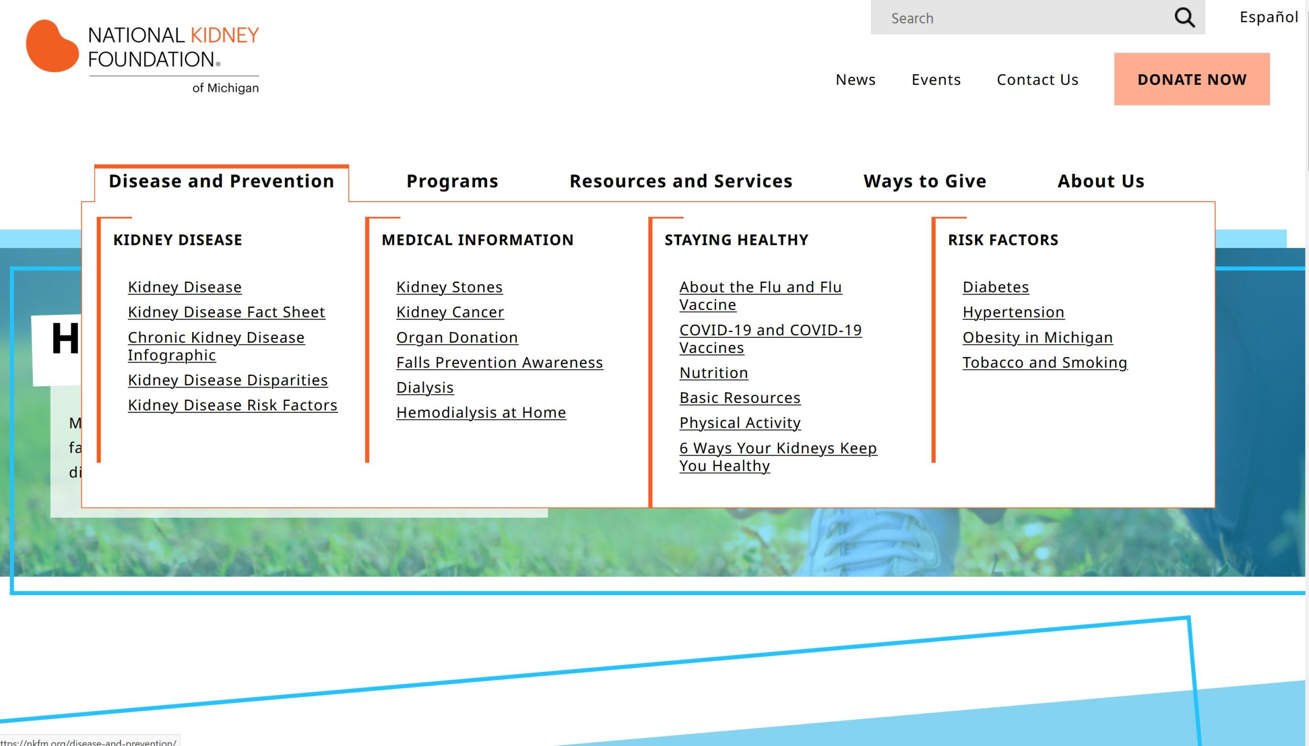
  • Introduce a mega menu to chunk out information, allowing it to be accessible without overwhelming users
  • Create a clear visual hierarchy to make the most important information easier to find

User Testing

We conducted three user tests to determine if our findings from the heuristic analysis were correct.
After synthesizing the data, users gave us three clear points.

  • Users want to easily read the large amounts of information on the website
  • Community, and the feeling of being safe and hopeful were important to users coming to the website
  • The website needed to be viewable on mobile devices, as users frequently used their phones to browse information on their health

User Profiles

After speaking with stakeholders and user testing, we found there were three main users that the website needed to cater to.

  • Users who were at risk for chronic kidney disease, and needed information to make informed decisions for their health
  • Users already diagnosed with chronic kidney disease, and wanted to learn more about treatment and get support
  • Donors who needed a clear path to making contributions

Because the first two personas were not as clear to us and stakeholders, we focused our desk research on developing them over the donor persona.

Diagram of one of two personas. Diagnosed with early stage chronic kidney disease.
Diagram of one of two personas. At risk for kidney disease.

Explore

User Flows

Our next steps were to map out flows that users would take through the website to reach their goals.

User Flow

A diagram depicting the steps of three user flows

Who are At Risk

For users at risk for chronic kidney disease, the flow needed to take them through gathering information about kidney disease and lead them to their next steps of signing up with programs offered by the NKFM.

Who are Diagnosed

The user persona who is diagnosed with chronic kidney disease would need easy access to more information about the disease, stories of people successfully living with the disease, and ultimately programs that the NKFM offers.

Information Architecture

Starting with a content inventory of the existing website, we created cards for each piece of content. With a card sort, we reorganized information, cut out redundant or repeating pages, and relabeled categories where it was most appropriate. This gave us the structure for an accurate sitemap for the users to navigate through according to their flows through the site.

Our organization of the mega menu comprised of five main categories, with two to four subcategories, each containing relevant pages.

We prioritized information about the disease first, and programs and resources next. Here’s why. The diseases and conditions information were strong landing pages for users who weren’t aware of NKFM’s programs. We wanted to draw these users through diseases and conditions they were learning about and show them programs related to the conditions.

Design

Sketches

Our first sketches for the site were designed for adaptation for development on WordPress, and were sectioned out.

Sketches of the NKFM redesign layout.

Mid-Fidelity Wireframes

Building upon the sections of the sketches, we created mid-fidelity wireframes.

Style Guide

We created 2 style tiles for stakeholder review, taking into account comments from user testing wanting more white space and cheerful colors. Ultimately, stakeholders preferred the tile with a bright color scheme, high variation of font weights with a legible typeface, and sleek, professional button styles.
The finalized NKFM style tile.

High-Fidelity Wireframes

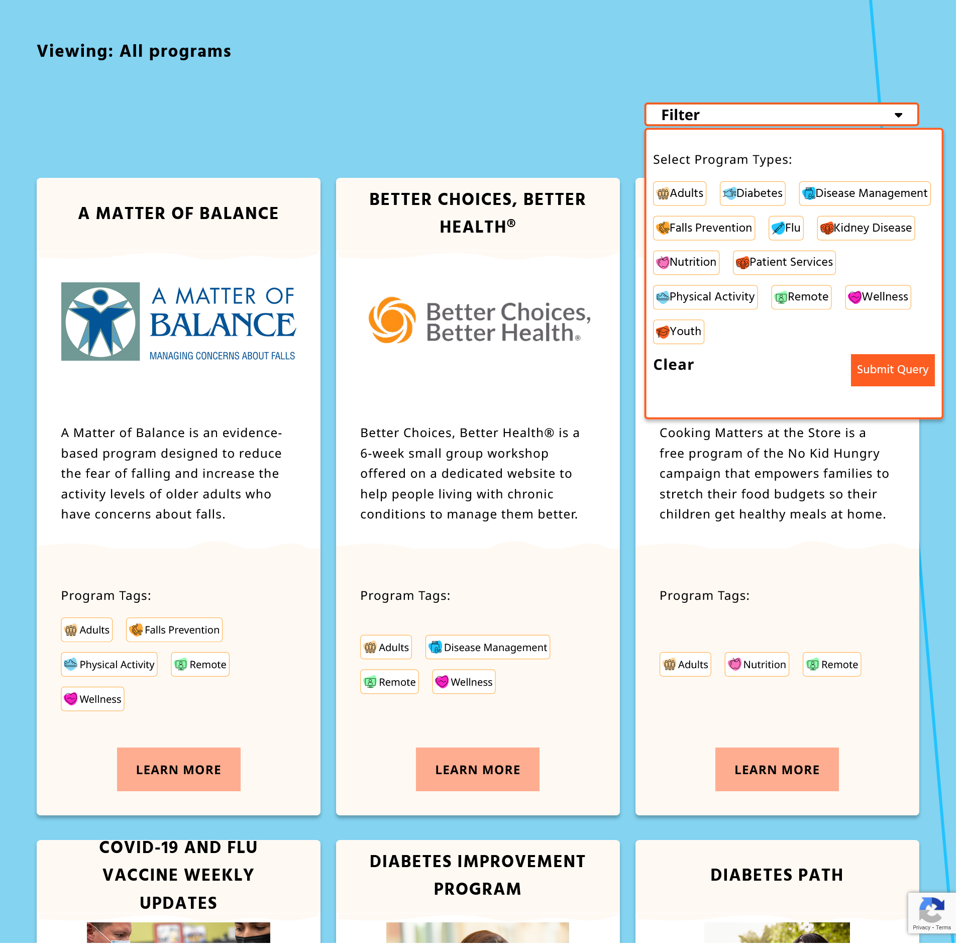
The designer created three variations of a homepage with styling applied. Each variation had slight differences in design, such as color filters over images, shapes on the section highlighting programs, and “confetti” pattern placement.

Create

Development

The design team met with the development team to discuss the nuances of the designs and how they might be translated into a wordpress setup. Our scope for the project was to create a custom wordpress theme with a Genesis framework, using CSS grid. The focus of the build was to create reusable templates, so that the client could customize the content of the pages.
Custom built page types included

  • The Programs page
  • Event page
  • Success Stories
  • Search results
  • Contact and form page
  • 404 page

Core Features

Some of the core features that were built specifically for the NKFM were

  • The homepage slider, which has tailored for better performance
  • Advanced Custom Fields, so the client had flexibility with inputting content without worrying about interrupting the site build
  • The search function, based on a wp plugin, with a custom search results page
  • Language options with the addition of gtranslate
  • Coding in accessibility, such as ensuring header hierarchy made sense for users with screen readers. We also helped the client understand the importance of header settings so the site could continue to be accessible
  • Mobile responsiveness, which was a key takeaway from user testing

Challenges

Through the course of development, the client asked us to extend our expertise to their Regie’s program portal. The goal of this extension was to create a portal where users would pay to access the Regie program offered on their website.

Because of the stability of the custom theme, we were able to apply the theme to a website separate from the NKFM website. This allowed the portal to be more secure than having it attached to the main website, but still offered the same styling and customization.

Validate

Quality Assurance

We worked alongside clients testing the stability of the website. As they added content, they could alert us to issues and tweaks we may not have found otherwise. In this way, the development team could quickly jump to amend issues as they arose.

Challenges and Roadblocks

While our initial scope only included 7 wireframes for a custom-built website, our designs expanded to 9 custom screens. The client was impressed with the work and was excited to have the screens included in their redesign. While this complicated our timeline, we ultimately decided to go ahead with building the extra screens.

During the course of the development, Standard Beagle underwent a turnover of the development team. Initially, production was halted in order for the new team to understand the project. However, they rose to the challenge, and they were able to better capture CSS grid, focus more on the mobile responsiveness of the website, and overall create a more stable structure.

Lessons Learned

Through the process of the redesign, we came to a better understanding of our processes, our knowledge of building custom wordpress websites with CMS, and how our new team worked together.

  • We found that designing for the web required us to design with a better understanding of how the designs would translate to code.
  • With a new development team taking on the project, they took on the responsibility of taking out code that was not working well, and rebuilding from the ground up. They came away with a greater understanding of building CMS.
  • The shift in the production team meant jumping in and learning how best to collaborate with one another. By the end of the project, we found how to work as a cohesive team, handing off assets and discussing how best to tackle issues. We not only learned about each others’ roles and how to make handoffs easier for all involved, but we became a cohesive unit working in lockstep.