Beat HIV UX Design & Build

Redesign and develop a new website for Tarrant County's HIV Agency
Expertise

, ,

Client

Tarrant County

Timeline

2 months

Challenge

Tarrant County wanted to help community members suppress HIV, be fearless about learning of their diagnosis, and reduce stigma associated with HIV.

To do this, Tarrant County wanted to create a separate website for their HIV initiatives, so they could better reach their goal to virally suppress HIV positive individuals in the Dallas-Fort Worth.

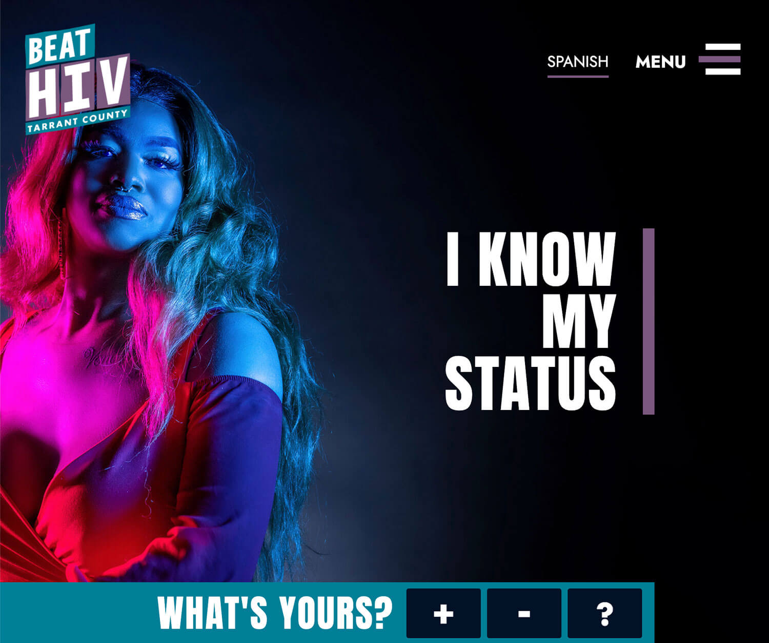
They wanted the experience to be cool and fun and to present information in a non-intimidating way. Tarrant County wanted to acknowledge the fears surrounding diagnosis while giving hope to those at risk.

We worked with our partners at Belmont Icehouse on this project — creating the UX flows, wireframes and developing the site, while Belmont provided copy and visual branding.

How might we create an experience that empowers individuals to discover their status while providing uplifting resources so HIV positive individuals can live to their life to the fullest?

Scope

The scope of this project included a full website redesign, user testing, and iterative development with the intention of helping Tarrant County reach their goal of increasing the percentage of virally suppressed HIV patients in the community.

Constraints

We had a two-month timeline for this project to implement the full UX process and develop a WordPress custom theme; we launched at the end of March 2021.

Implementation

During our process, we implemented a Spanish version of the site by adding a translation plugin.

Our Goal

The goal of the project was to ensure that community member’s fears are acknowledged, and to provide resources that show that you can live with an HIV positive diagnosis.

To do this, we needed to achieve these goals:

  • Provide informative and easy to read resources to educate
  • Create a space of community, support, and acceptance
  • The experience needed cool, fun, edgy
  • Information needed to be presented in a non-intimidating way
Our Solution

What we discovered in our meeting with the stakeholders was the multitude of barriers and stigmas surrounding diagnosis and treatment.

Results

Beat HIV Tarrant County’s new website launched in April of 2021.

Since the launch, the organization has been driving traffic to the website through a variety of awareness campaigns. The client has been able to manage content and language updates on their own as a result of our work.

Our Process

Understand

To better understand the barriers that prevented individuals from pursuing diagnosis and treatment, we had a lengthy discussion with the stakeholders. Being that the stakeholders had first-hand experience working with individuals from their local community, we conducted a user profile exercise with them so we could better understand their key audience.

Following the two-hour session, we left with a better understanding of the experiences individuals from at risks communities face to develop empathy and understanding. The session also helped us define the typical user who would be coming to the Tarrant County Website to discover information.

User Profiles

  • Based on the information discovered, it is clear that a lot of barriers prevent individuals from seeking care.
  • Whether they are HIV positive, there is fear of stigma and feelings of isolation that prevent action.
  • Additionally, lack of access to basic resources prevent individuals to seek care because they are more worried about attaining food, shelter, transportation, and general health care.
  • Even when an individual has their basic needs met, there is still judgement from interpersonal networks that discourage action.

Creating an Experience

From the research, it was clear that the audience wants to be heard, accepted, and understood. We knew it was important to generate feelings of inclusion when individuals visited the website, so we came up with the following ideas on how to create this experience.

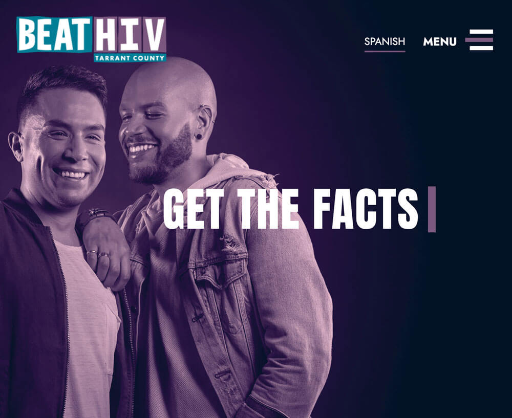
Images of People From At Risk Communities

  • It was important for us to help generate feelings of inclusion by having impactful imagery on the new website.
  • HIV positive success stories
    Success stories would demonstrate that U=U is attainable, achievable, and allows those with a positive diagnosis to live a normal life.
  • Customized flows for each diagnosis
    Individuals are most likely coming to this website experiencing intense stress, nervousness, or frustration. Therefore, information should be as easily accessible as possible. Customized flows would allow those to quickly find the information that pertained to their situation.
  • Thoughtful posts and articles
    Individuals want to hear about the success stories and the wins surrounding an HIV positive diagnosis. They need to feel fearless on their journey, and receiving positive affirmations would help.

Explore

We created user flows to explore the ways a user might navigate through the website.

User Flows

The three unique diagnosis paths were mapped out to include the relevant information those individuals would be searching to uncover.

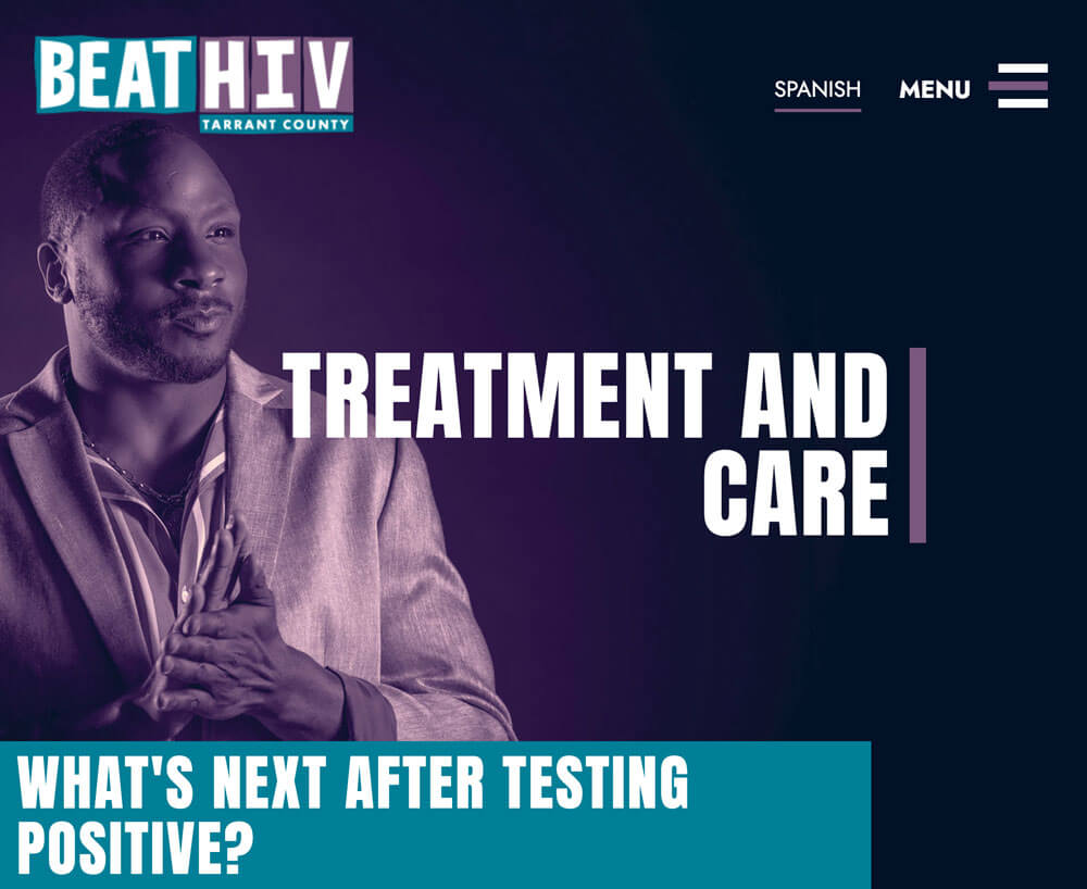
Treatment and Care Flow
The Treatment and Care flow would explain how people could get healthy and stay healthy, how to find a treatment provider, and get back into treatment. In this flow, individuals could easily find facts about Undetectable = Untransmittable (U=U), meaning those with HIV who are undetectable cannot transmit HIV. We also highlighted success stories of those who are living with HIV to encourage people who recently found out about their diagnosis.
Prevention Flow
The prevention flow highlighted information about how to keep an HIV negative status by reducing risk, with links to resources to receive free condoms or medications that help with prevention.

Screening and Testing Flow
The screening and testing flow provided resources on how to get tested, either at home or at a local facility, while advocating the benefit of knowing your status.

Design

With the user flows mapped out, we wanted to explore how the visual experience might look.

Sketches

Sketches were created to explore layout ideas. We wanted to ensure we were organizing the information in a way that made sense to the audience by highlighting the most important pieces of information at the top of the page. We also wanted to explore varying ways we could structure the content to discover which layout would be the most impactful.

Mid-Fidelity Mockups

The best of the sketches were designed in Figma using real content from the old website. Being that this website was smaller, we were able to design how each page would look, and were able to where the content should be on these pages.

Create

A clickable prototype was created for user testing.

Prototype

View it in Figma here.

Validate

We conducted small-scale, remote user testing on five individuals within the target demographic. By using a clickable prototype, we tested our design concepts on potential site users to ensure that the design met the users’ needs.

Testing Goals

The testing scenarios were designed to be open-ended, so we could see how a participant moved through the site and uncover any potential roadblocks he or she encountered. This type of user testing collected both quantitative and qualitative data.

Findings and Recommendations

We used an affinity diagram to sort through the insights discovered during the usability testing sessions and compiled a presentation with our findings paired with iteration suggestions.

Iteration Suggestions

Improving the search experience
We added a button background to the search bar to make it more prominent.

High-level, neutral content on the homepage
The users we tested wanted to see high-level information with a neutral context on the homepage. We made sure that the homepage was educational in nature, rather than specific steps about treatment, testing, or prevention – relocating specific content to the respective top level pages that match their flow.

Changing the language for the tailored flows
The participants appreciated that the content would be tailored based on their selection and that key information was presented at the top of the page along with other resources to support their diagnosis. Though, we iterated the titles of these flows to make them feel less intimidating.
We changed:

  • ‘HIV Positive’ to ‘Treatment and Care’
  • ‘HIV Negative’ to ‘Prevention’
  • ‘Not sure yet’ to ‘Screening and testing’.