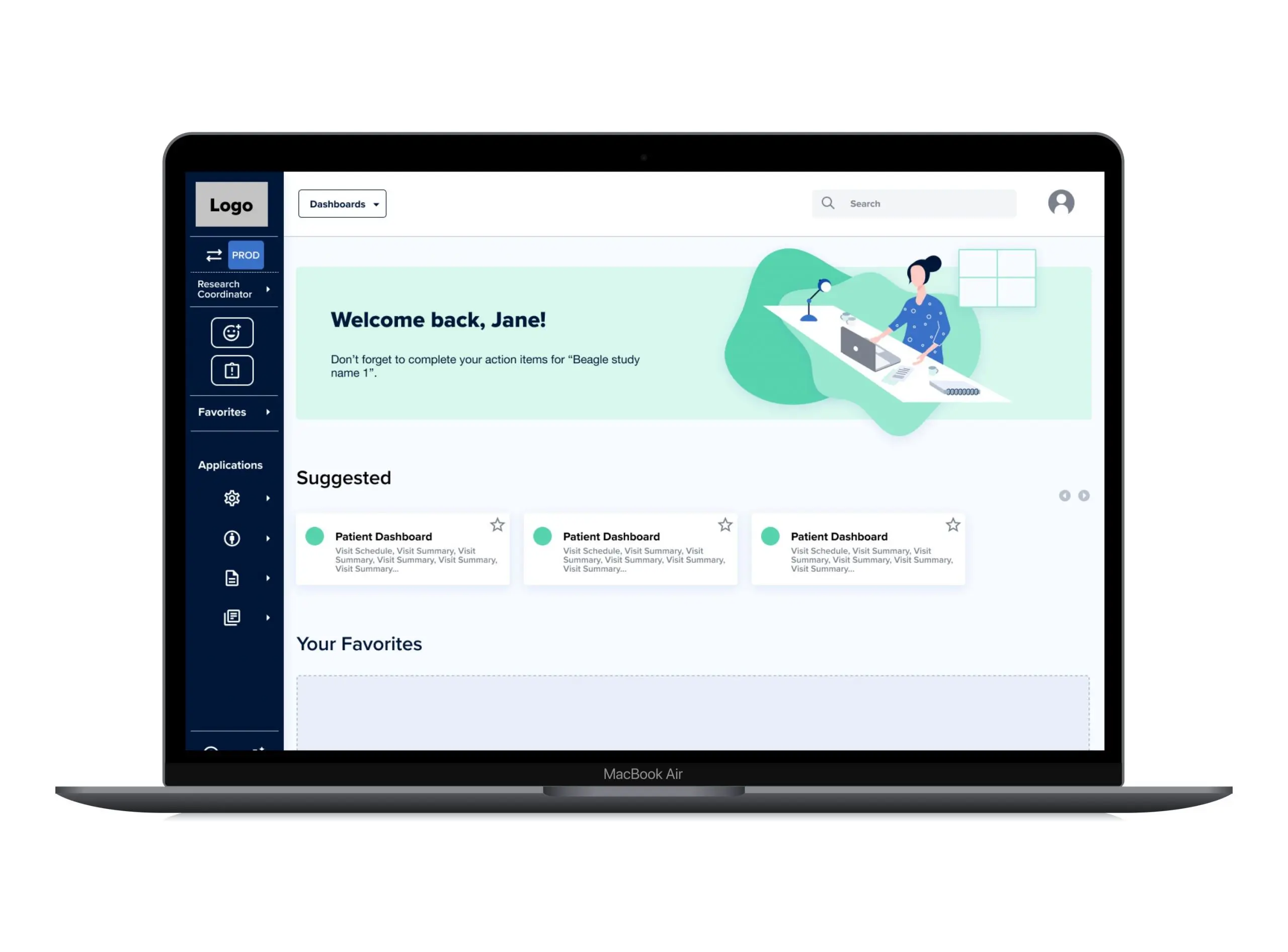
iMednet Redesign
Clinical trial platform with updated UX/UI

Challenge
Mednet provides medical researchers with a platform for creating and managing clinical studies, called iMednet. Medical study organizers can create and customize a study, and then give access to participating medical facilities for their staff to collect and record data directly into the system.
After years of iterations to its offerings and expanding features, this client wanted to update the look and feel of the UI to better engage clients and end users.
Mednet was concerned the platform’s UI had become dated and did not look appealing to new prospects for the platform. They reached out to Standard Beagle to understand how and where they should begin reworking the platform.
How might we redesign the iMednet platform that allows for flexibility while creating a structure that’s easy for users to follow?

Scope
We started with a 2-week Blueprint to determine scope and approach.
The design scope for this project included restructuring global navigation, a global style guide with reusable components for developer handoff, and two main flows wireframed with clickable prototypes.

Constraints
We worked in three phases of design over the course of five weeks.
We worked closely with stakeholders, who made themselves to answer questions and provide feedback. While we were not able to work directly with end users, the product team connected us with customer success.

Implementation
Our component guide was built with Storybook and the Material UI library for development with React.
After handoff, the development team began their implementation.
Our Goal
The design team at Standard Beagle restructured and restyled the platform. Our aim? Give a comprehensive guide of materials for the Mednet development team.
Goals
- Update the UI styling for a more modern look
- Reduce the number of clicks for users to navigate the platform
- Design components that can slot into the existing framework
Our Solution
We decided that creating a new style guide with a comprehensive component guide combined with a navigation restructure, would ease key pain points for the end users: busy nurses and doctors.
Results
We recommended restructuring the information architecture alongside the UI update for a better impact on usability and accessibility.
With a heuristic evaluation of the platform, we came up with a blueprint for the redesign that included reworking the navigation and hierarchy, several wireframes with a clickable prototype, and a style and component guide for the development team.
With UI and UX updates to the platform, we gave the development team comprehensive guides for creating the new UI, along with a hierarchical rework that would allow end users to move through the highly flexible platform more quickly.
Our Process
Understand
We started by speaking with stakeholders to better understand their goals for the redesign.
Stakeholder Interviews
We conducted 15 interviews across the organization. We found that while users liked the flexibility and customization the platform offered, the navigation was unintuitive and user paths could be overwhlming. The confusion complicated new users’ ability to quickly adapt to the platform.
The iMednet platform is used to record and analyze data for medical research studies. Users included the study creators, who could create custom logics for inputting data. End users were also medical staff of participating hospitals and organizations at various levels who could review and sign off on recorded data.
We focused on the end-users, who are the registered nurses inputting data on top of their daily tasks.

Heuristic evaluation
Using Jakob Nielsen’s usability heuristics, we reviewed the current state of the platform focusing on the path of the registered nurse user persona. We found several points where the platform could be improved.
- Using a unified naming convention which did not use colloquialisms
- Clear hierarchy of information in the form of headers
- Better color contrast to help establish hierarchy of information and color code alerts and errors
Explore
Card Sort
With a clear picture of how we could improve the platform, we started with the navigation.
We took stock of all the content on the current platform, put them on cards, and shuffled the information. We then had 6 internal users sort the content into groups and hierarchy that made sense to them.
During the card sort, we noticed several issues with the content that contributed to each grouping being different.
Nomenclature
Users were confused by nomenclature of the content. The naming itself did not indicate the function of the content. Users found similar naming conventions for different pieces of content to be confusing as well.
Insights and Opportunities
1Nomenclature was too vague, too similar to other functions, or assumed users understood colloquial abbreviations to navigate. Global headers would need to use unabbreviated titles and not overlap unless similarly grouped by function.
Context and functionality
Users said they needed more context to the functions of each piece of content in order to group them with confidence.
Insights and Opportunities
2Users who were not in the medical field were unsure if they didn’t understand nomenclature because of their lack of expertise.
Extra functions
Users found actions outside of the end user flows were unnecessary.
Insights and Opportunities
3By having multiple user flow functions appear in roles that could not utilize them confused users.
Role action grouping
Users felt individual role actions were dispersed throughout the different drop down menus on the navigation bar.
Insights and Opportunities
4All actions pertaining to patients should be grouped together.
Information Architecture
With an understanding of how users would think to find information, we reconstructed the navigation.
The major changes were to add a sidebar menu for customized information. The top navigation bar was simplified to access dashboards, user information, and a search function.
- New category names were added for clear taxonomy.
- Repeated or confusing content names were revised for clarity.
- User Dashboard and Patient Information were put into one place.
- Removed categories on navigation bars that only had one page under it.
- Applications list was shortened and made available on a sidebar navigation.
User Flows
Our next steps were to determine the most utilized actions of the users and focus on building these screens.
We determined that, with the end-users, the most important flows would be
- Onboarding for new users to the platform
- Entering patient information as a nurse or a person responsible for entering data
- Checking queries, or flagged information on entered data, and fixing discrepancies
Design

Style Guide
- The style for Mednet utilized the blues of the Mednet logo, adding similar hues of colors at different shades for contrast and cohesiveness.
- Iconography was taken from React’s Material UI library for easy integration.
- Buttons, inputs, and cards were given unified styles for default, hover, clicked, and disabled states
- Selectors and animations, such as loading progress bars, were documented
Validate
Iterations
After delivery of documentation, guides, wireframes and prototypes, we collaborated with the Mednet team to make iterations:
- Changing the overall background color of the sidebar menu to provide contrast between the page and top bar navigation
- Made the decision with the client to limit the amount of pages users can add to ten, so that the dropdown navigation in the sidebar menu does not become overwhelming
- Added the sponsor name above the study name in the sidebar menu for clarity
Challenges
Because of the highly flexible nature of the platform and the wide range of information that needed to be accessible quickly, the information architecture relied on structure in the form of visual hierarchy. While structure and logical user flows lead to simplifying the platform’s content, we needed to balance simplification and the ability for customization that made the platform unique.
Our answer was to group the dashboards for various data collection under one navigation tab, with the added ability to use a search function when clicking though navigation did not work.