Central Health Screening App
Assisting Central Health help more people find access to care

Challenge
The mission of Central Health — the Travis County Healthcare District — is to bring healthcare access to more people.
The entity has a program called the Medical Access Program (MAP) which helps provide access points to eligible Travis County residents. One of the ways the program reaches potential participants is through outreach programs at health fairs and community events.
During these events, a representative would talk with people about whether they might be eligible for the program.
Central Health found this method effective, but when the representatives were talking with one person, they might miss out of many others. They wanted a way to screen and capture information from more people who might be eligible for the program.
How might we help more people learn if they are eligible for the Medical Access Program?

Scope
Our scope included discovery, design, development, and user testing. We provided the wireframe designs to Belmont, who added visual styling.

Constraints
We worked on a tight timeline. The program kicked off in late August and needed to be complete by the end of September.

Implementation
Our work included both the kiosk app for the end user and an admin app for updating data to the front end.
Our Goal
Central Health thought technology may be able to help.
They turned to Belmont Icehouse, a marketing agency vendor working on the health fair branding, for help; Belmont brought in Standard Beagle.
We worked closely with Belmont to outline the goals and requirements for the project.
This project would develop a modular kiosk app. The goal of this digital experience would be to help the Central Health team identify as many eligible people as possible.
The app would provide three different interactions:
- A high-level pre-screening tool that determines basic eligibility and collects information for further screen
- A map tool to see where Central Health’s network of providers are located
- A tool that allows the user to watch a video to learn more about Central Health
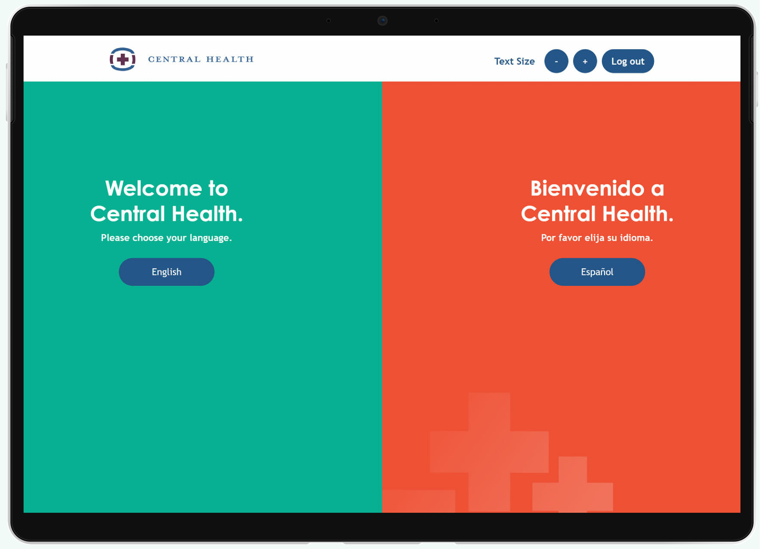
The app would be loaded onto a tablet, such as an iPad, and the user would be greeted with a screen that provides the different activity options.
Our Solution
We collaborated with Belmont Icehouse to develop a React App and admin for outreach representatives.
Results
Central Health has been using the app since it launched, and even expanded its use.
Prior to COVID, the Central Health team used the app for eligibility pre-screening at health fair and community events. Then they expanded its use for workers who knocked on doors during campaigns in Travis County.
Our Process
Understand
In our discovery kickoff, we will meet with key Central Health stakeholders for a background session.
Stakeholder Session
In our discovery kickoff, we met with key Central Health stakeholders for a background session. We reviewed the goals and requirements outlined in the proposal, set expectations and communication strategies, and fine-tuned the technical requirements for Central Health’s app, as well as the timeline of deliverables based on the actual start date.
We explored many questions during the discovery period and uncovered requirements for the app.
Explore
Next we analyzed what we learned and defined the details of the app and how it will be built.
The technical architecture needed to address how the app would:
- Handle data
- Handle interactions between systems
- Be situated in its environment
Technical Architecture
HIPAA was a consideration as well as security. We needed to ensure that the data could not be accessed from the app itself after it was saved. It needed to be saved in a secure environment.
User Flows
We designed three interaction flows. At any time, users can toggle between languages — helpful for those users who may be comfortable with Spanish but also can read English.
Pre-screening option
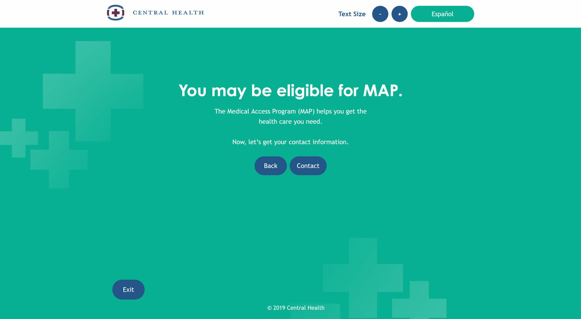
When a user clicks on this it would walk a person through a series of questions. Each answer the person provides determines the next step and what will be shown on the screen.
At the very end of this flow, the kiosk would capture contact information from the person so that they can be contacted for further screening and eligibility.
The tool would collect basic contact information and preferred time of appointment.
After the person puts in their info, the data would be stored in a secure database. We will give Central Health the ability to export the collected data in spreadsheet format.
Map option
With this option, the user would be presented with an interface that asks for a location (like their home or work). The user will type in the location and tap the submit tool. The tool would use Google Maps API and results from a database to show the locations nearby with the ability to zoom or expand the view of options. No additional information would be collected.
Video option
With this option, the user would see an interface that allows them to view a small library of videos. The videos would be hosted using YouTube, and the screen would display the appropriate embed code. All captions would be located within the video and on YouTube. No information would be collected from the user from this module.
Design
With approval from the client for the flows and technical plans, we moved into design.
We needed to design two apps — the first was for the end user who would see the kiosk at a health fair.
Wireframe - Kiosk App
The client had decided that they would use Apple iPads at health fairs, so our design focused on this screen size.
We conducted in-person moderated testing on a small group of users using a paper prototype, to ensure we were on the right track.
Later, we turned the kiosk screens into a clickable prototype for additional testing.
Wireframes - Admin
On the admin side, we designed basic screens for an app that would allow the Central Health team to update data in the app.
It was essential that Central Health be able to update poverty guidelines and locations so that the data would be current.
We also made this into a clickable prototype to ensure that it captured the right elements.
Create
We developed the app on our development server and tested frequently using native devices.
We chose to develop the in React because of the number of interactions required.
Front-end Development
It made sense to use React because we needed a high level of control and interactivity that a UI level framework would afford. And while the app would be used on a device, developing in react mean that it could be published on the web. Developing the kiosk app as a native app would have added to the cost and been overkill in the long run.
Time also was of the essence, and coding by hand would have taken longer than we had budgeted for the project.
We developed locally on our server until it was time to move the app to the production server.
Validate
The app underwent a second round of user testing during development, but this time, with patients.
User Testing - Validation
We chose to test during development before key areas were at a point where they were difficult to change or correct.
Our goal was to find any major sticking points with app usability and flow.
We tested the app with six members of the Central Health population during in-person moderated sessions.
Key Takeaways
We found three main usability issues from watching users interact with this app. Those takeaways are regarding the size of buttons, display of the keyboard, and navigation around the map module.
Button Size
Although we made the buttons the minimum required size of 44px, the users had a little trouble click the small radio buttons. At first the users would tap it without being precise and would then move on to tapping with the tip of their finger.
Keyboard Interference
With the accessibility standards applied, the keyboard took up the majority of the screen and users had issues with moving between form fields, navigating the map, and hiding the keyboard.
Map Module Navigation
When inputting the start address, the pin for that location does not display which seemed confusing to users. Many did not know how to proceed. The users could not tell what to do because nothing on the screen had changed. They did not know that transit options and addresses will appear by click on a pin in most cases.
Next Steps
- Change “Find a Doctor” to “Find Health Care Services”
- Change the contact button at the end of the screening to a more firm call to action
- Display the starting pin on the map in another color
- Enlarge the radio buttons
- Have different colored pins for the different types of providers
- Make the provider type list more condensed
- Add a search button on the map module
We iterated on the design and adjusted the app in development.