Images are a powerful tool for websites and digital products
Visuals communicate the personality you’re trying to attract, the mood you want users to empathize with, and the feeling you want your users to leave with after using your product. And there are do’s and don’ts for using images in products and websites.
Why are images so powerful?
A person forms their opinion about a webpage in just half a second. What’s more, that first impression has big consequences. Seventy-five percent of users judge the credibility of a website by the aesthetics.
The right images are crucial to a successful website.
Used correctly, visuals can grab new users and contribute to both retention and satisfaction. Used poorly, and users overwhelmed, underwhelmed, or lost in fancy graphics that don’t lead them to their next action.
Dos and don’ts for using images in products
Great looking products don’t necessarily translate to a great product. Particularly, when great visuals get in the way of the ability to use the product efficiently. While the balance can often be subjective, there are certain lines that, when crossed, create more frustration than satisfaction. Here are some easy dos and don’ts to watch out for.
Images
Don’t
Images with important visuals help build brand identity. This is especially true if the subject matter is directly important to the product.
A common problem is when text is put over the image, and becomes illegible in doing so. Even if the text on a current image is legible, in the event that the image changes, text can get lost in the new image.
Do
As seen in this article on best practices with images, adding a gradient or opaque layer beneath the text, but on top of an image can create enough contrast no matter what image is displayed.

Text
Don’t
When you find just the right font style that matches the sensibilities of your product, it can be hard to let it go. However, if not utilized well, your choice can make it hard for users to read. Text that is too stylized or too small (or both) will discourage users from exploring the product simply because they don’t notice important instructions, calls to action, and navigation.
Do
With text, especially highly stylized fonts, be aware of the size of text.
Keep headers and body copy at a minimum of 12px on desktop and 16px on mobile or larger to stay within WCAG 2.1 accessibility guidelines. Generally, 14px on desktop is recommended as a minimum text size for better readability.

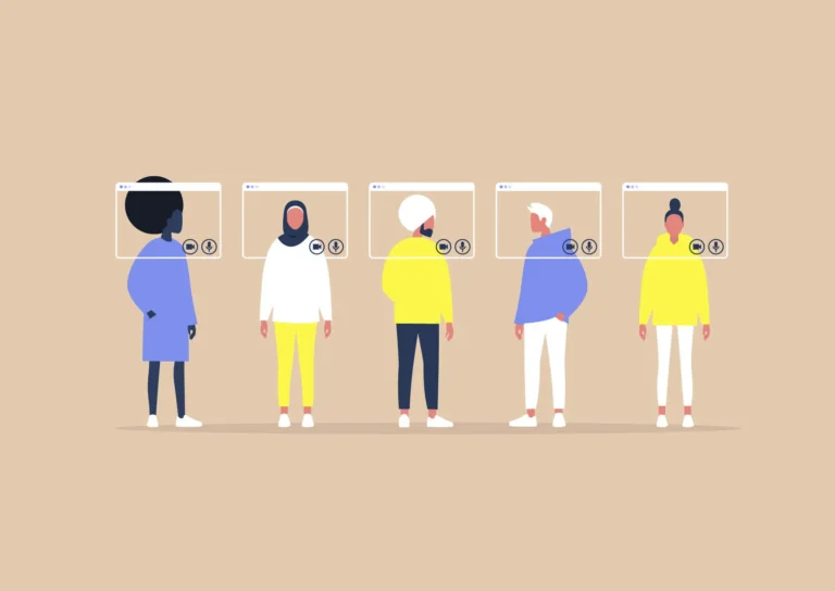
Using Color to your Advantage
Don’t
Color is a big part of branding and putting your users in the right mindset on your product. However, not every palette is friendly to your users.
Lack of contrast between text, important buttons and components, and the background they’re on can create friction.
Reduced readability means there’s a higher chance users will skip over text and buttons they need to interact with. The chance gets worse with users who have issues with eyesight.
Do
Cross check color coordination with WCAG AA and AAA contrast standards.
Various tools can tell you whether or not your choices pass these standards, and if not, suggestions to fix it. These accessibility standards ensure a base level of contrast for users across the spectrum of eyesight.

Iconography
Don’t
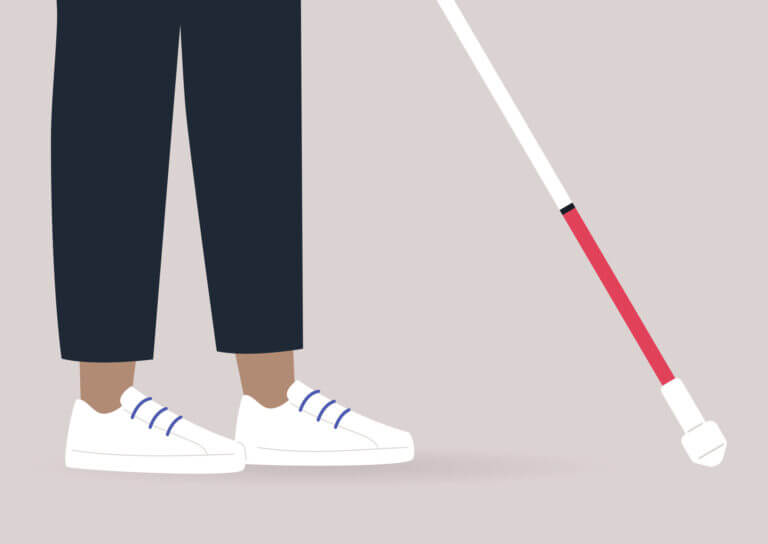
Iconography can help convey functionality without the need for words. For instance, a house icon is universally understood as the home button, taking you to the homepage or dashboard.
A floppy disc icon is understood as the save button. It’s so ingrained in our online lexicon, that younger generations recognize the symbol, despite never having used or seen a floppy disc.
This does not apply for every icon, nor does a single icon convey complex functions or actions. Incorrect use of icons can confuse and frustrate users (of all ages).
Do
Use existing systems to your advantage. This means there are universally understood patterns that most, if not all, users recognize without explanation.
In the event that some icons may not quite match up to their intended function, add text to lead users in the right direction.

In the Viewport
Don’t
It’s tempting to fill the users initial view with either flashy visuals or as much vital information as possible.
This leads to two different problems. With large visuals, such as a graphic or photo, it can push content and calls to action further out of reach, making users scroll past in order to find what they need. In putting everything they could potentially need in their immediate view, it can overload the user leading to confusion on where to start.
Do
Balance visuals and important information in the initial view of the screen. Even when it seems obvious which page you’ve landed on, have the page title in the header so users know that they reached their destination.
A quick subheader description of the purpose of the page can also help users see at a glance if they are in the right place. When there is a lot of information to display, organize the information by its importance to users.
The most important content should be put within immediate reach, while the next important content can be scrolled to. It’s important to remember that users can form an opinion in less than a second.


The visuals you employ can be the difference between interest or boredom in the split second it takes to form an opinion. Used well, the combined look, layout, and content styling can subconsciously direct users to their goals, ultimately fulfilling your goals as well. Smart and careful styling can bring in more users through accessibility as well as thoughtful design.


