
Expertise
We executed a heuristic evaluation of key pathways, a 14-day analysis of heat maps, website analytics, recordings, and nine user tests.

Client
The Dallas Opera provides entertainment to a diverse audience. After suspending their opera season due to COVID-19, they reopened a new season with the addition of a digital streaming service.

Timeline
This project was part of a long-term engagement with Dallas Opera to maintain and enhance the website.
Challenge
Patron changes over time
The Dallas Opera needed help with the organization of content and navigation. After several years without major updates to the website and the expanding amount of content, navigation had changed many times. There was concern that it no longer served their needs.
Solution
Move forward with arts website navigation redesign
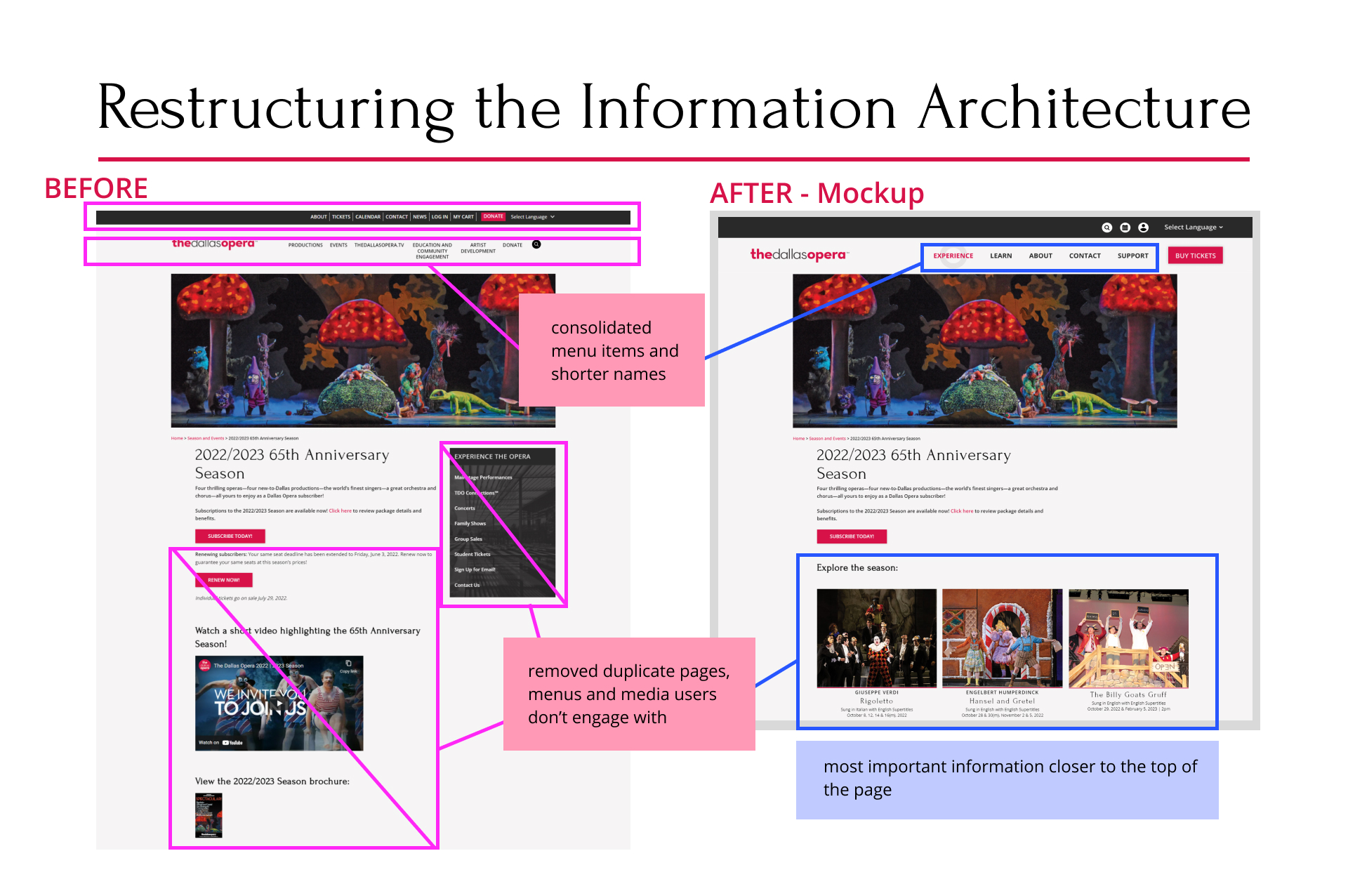
We recommended a more streamlined navigation. Our recommendations were based on our interviews and tests with current Dallas Opera patrons.
Our recommendations for structural changes would simplify navigation and page layouts.
These changes included a redesigned main navigation bar in the form of a mega menu, and removing the sidebar navigation.

Impact
We improved the navigation and made sections more visible
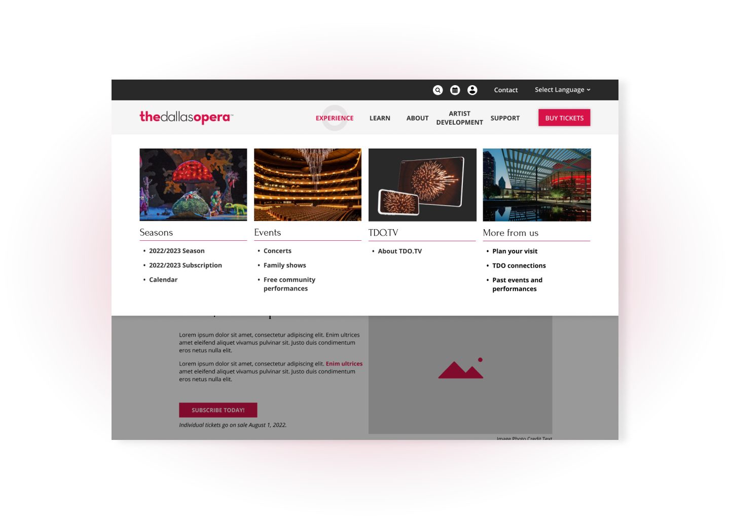
Mega menu to show all sections
A mega menu removed blocks from the users’ paths.
We replaced the main navigation bar with a mega menu, putting all important information in one easily accessible place.
Revised content structure
Other changes included restructuring the layout of the navigation on the page. We also recommended:
- Removing the side menu, which created confusing navigation loops and conflicted with the main navigation bar.
- With screen space freed by removing the side bar, components such as cards featuring single performances, could spread out across the page.
- Reformating page layouts and limit content to remove extra page scrolling.
Free Download
Why UX translates to product profits
Download our free guide in PDF format to see how UX can help your product team improve customer retention and profits.