This is part one of a two part series on the best practices for designing with images.
Designing with images increases engagement
Why? Humans are visual creatures

This is why visuals matter when it comes to capturing the attention of people.
In this article, we will review five best practices for designing with images that will increase reader engagement.
A study conducted by Brainrules shows that vision trumps all other senses. People will remember 65 percent of a piece of information when they see it with a visual. That number drops down to 10 percent when you take the visual away.
And it’s not just photos that are visual. The brain interprets each letter as a visual and translates it into the words we read. Because the human brain identifies certain features in the letter in order to read, it takes time and is inefficient.
But when the brain sees images — such as videos, photos, icons, call to actions, and infographics — the interpretation is faster. That’s why these visual elements are far more engaging than just blocks of text.
1. Choose images that matter
The human brain can interpret images much more quickly than text. That’s why it’s a good idea to use images in addition to text to convey information.
Good images communicate instantly and effectively. They can even go further in communicating context to a story, providing a more immersive experience than plain text.
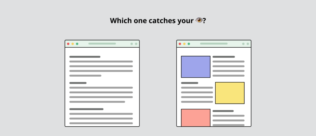
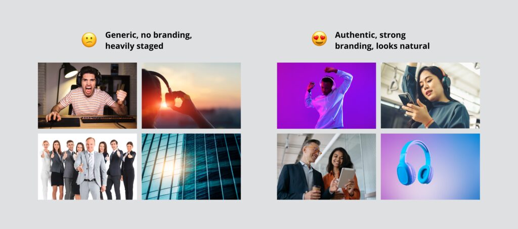
In a competitive space, a good image can set your content apart from the crowd. The right type of image should capture a user’s attention, inform, and engage enough to assist in converting that user into a valuable customer. This means steering away from generic images. Designers should choose images that have personality, feel authentic and relevant, and are specific to your brand. A high-resolution image of your product is a plus!
On the other hand, images that lack relevance or context are confusing, cheapen your brand, and affect your users’ trust. Images should not look generic, impersonal, too cheesy, or look staged.
2. The perfect image dilemma
While it is extremely important to choose the right image, there are cases where using the ideal image isn’t possible. This often happens in the design phase of creating a web content, whether that be a website, product, or web application.
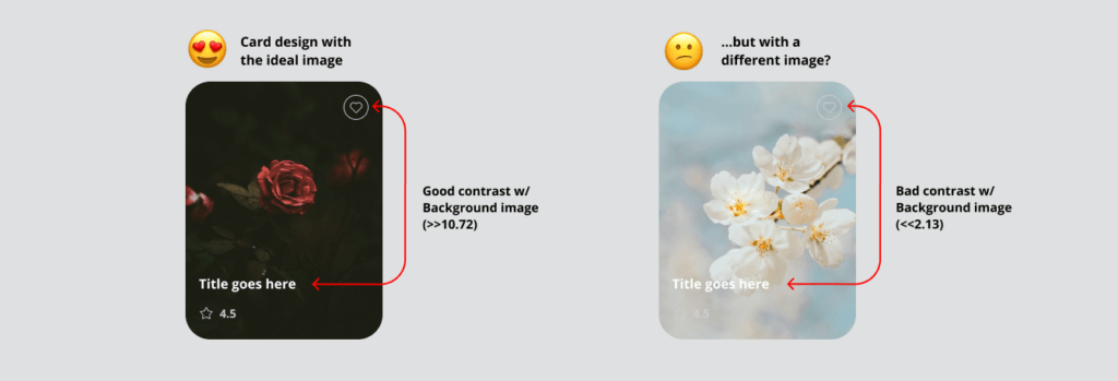
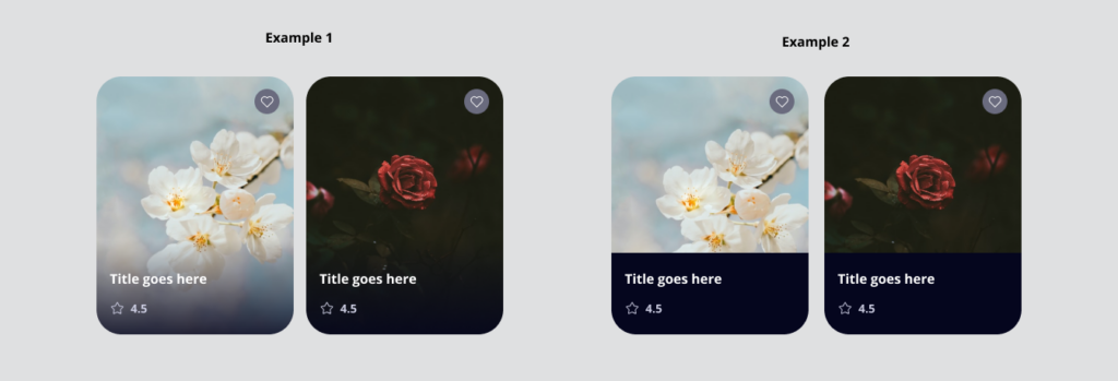
Here’s an example. Imagine a scenario where content — such as text — needs to be placed on top of an image. The example below shows a card design where the entire card is composed of an image. There is text, an icon, and a widget designed to display on top of the image.
In this scenario, you may approve the example design on the left. Afterall, it looks fine now because the image is dark. But if a designer doesn’t consider what happens if the image is replaced with a lighter image, it could cause problems.
The card on the right in this example uses the exact same design. However, the icons, text, and widgets are nearly impossible to make out. Not only does it fail WCAG accessibility standards, but it also — quite frankly — looks unattractive. The resolution and the beauty of the image would not matter at this point.
To fix issues like this, designers need to consider how the content could change over time. The design needs to reflect content clearly, no matter the type of image being used underneath.
A designer could fix this by adding a gradient to the bottom under the text. They might also where the content goes, or even add an opacity behind the text.
It’s important to remember that a strong design with images can accommodate all types of images, especially those used in dynamic content.
3. Steer away from images of text
“Images of text” refers to when readable text is presented within an image. This includes text presented in a fixed image in order to achieve a certain design style outside of pure text content, according to the University of Colorado’s guide on Digital Accessibility and Inclusive Content.
Web Content Accessibility Guidelines (WCAG) do not recommended using images of text, for the following reasons:
- Lack of inclusiveness
Screen reader users and users who need a web translator will struggle. Similarly, any visually-impaired users will struggle to read any images of text. - Does not consider mobile users
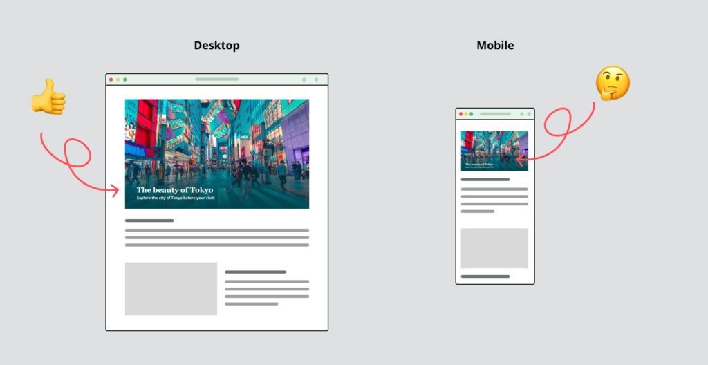
When images of text are scaled down to mobile size, the text within images will decrease in size. - No SEO benefit
Search engines (like Google) do read alt text, however, they they also scan text index content for keywords. While search engines will read the title and alt text, they can’t actually see the text displayed in the image. - Difficult to maintain
Changing text inside an image cannot be changed unless you have the original file that the image was created in, as well as the program it was used to create it with.
Exceptions for images of text
There are exceptions to this rule. Ask yourself if the image with embedded text:
- Uses purely decorative text
- Presents an example of typography or is part of a graph/label within image
- Is a brand logo
Best practices for images of text
Designers should focus on using real text wherever possible. Use CSS to visually style text to achieve dynamic visual designs!
Also, always provide alternative text for non-decorative image.
4. (Almost) always provide alt text
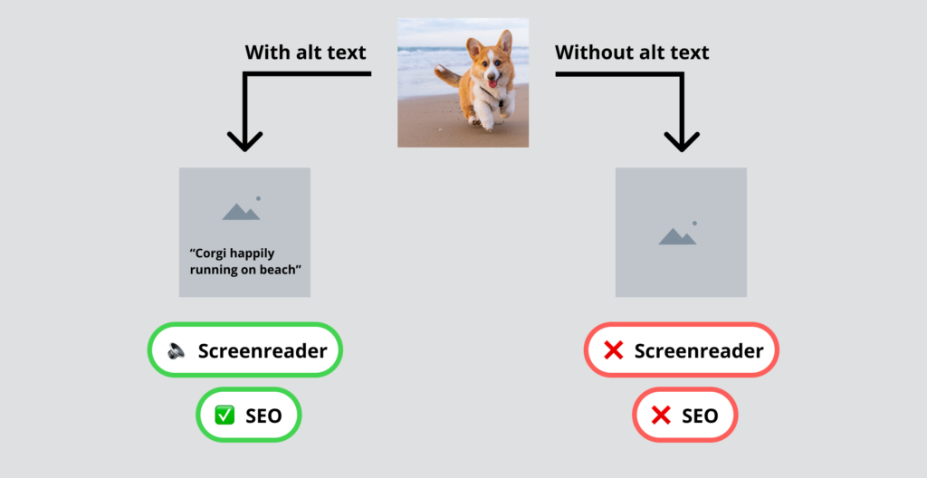
Alternative (alt) text is a written copy of text that describes the content of an image and appears in place of that image if it fails to load on a user’s screen.
It’s a best practice to add alt text to every image that conveys meaning. If you don’t, a a person using a screen reader or a user who disables image loading or encounters a broken image won’t know what the image is meant to convey.
While it may not be visible when the site loads, providing alt text will also help with your SEO – which can’t hurt!
You don’t need to provide alt text when the image is purely decorative, or if it is described in a block of text nearby.
5. Don’t just use photos
When someone says “images,” you may automatically think that only means photography.
However the word “images” can include many other forms of visual content, such as videos, gifs, illustrations, visual quotes, icons, calls-to-action, infographics, and more.
These visuals can guide the user to different actions, catch their attention, or showcase facts and statistics. But they are all great mediums to engage your users to read important information presented in the page, because it creates hierarchy.
Let your visuals help you out
Choosing the right images for your site can seem like a tedious task, but the visual appeal of strong images and branding can be extremely beneficial!
In part 2, we will talk about how and why you should optimize your images, along with why it matters with your SEO.
Suggested reading and watching
Designing with the Mind in Mind | Jeff Johnson | Talks at Google
- Vision trumps all other senses (Brain Rules by John Medina)
- Images of Text | Digital Accessibility and Inclusive Content | University of Colorado Denver
- 15 Ways to Use Visual Content Marketing to Capture More Traffic
- User Attention: 10 Psychological Facts to Help You Design Better UX
- https://startdigital.com.au/importance-of-good-images/
- Text vs. Images: Which Content Format is Effective?
- Images of Text | Digital Accessibility and Inclusive Content | University of Colorado Denver
- 1.4.5 – Images of Text (WCAG 2.2 Level AA) | Wuhcag
