Include these visual design principles in your B2B product
Visual design is a critical aspect of the user experience for any software product, including B2B SaaS products.
A well-designed visual interface not only improves the usability and functionality of a product, but it also creates a strong brand identity and builds trust with customers. In this article, we will discuss the essentials of visual design for B2B SaaS products and how they can help enhance the overall user experience.
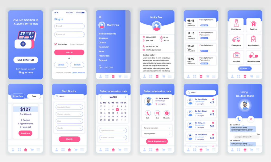
Consistency
Consistency is one of the most important principles of visual design. This means that the visual elements of a product should be consistent in terms of style, color, typography, and other design elements.
Consistent visual design helps users understand the purpose of a product and navigate it easily. For example, if a button is always blue and rounded, users will quickly learn to associate that style of button with a specific action, such as “submit” or “save.”
Consistency also creates a sense of professionalism and reliability in a product. When users see that a product has a consistent visual design, they are more likely to trust the product and feel comfortable using it.
This is particularly important for B2B SaaS products, because these products are typically used by businesses and their employees who expect a high level of professionalism and reliability. Users can count on future iterations behaving similarly and stick to their mental model while using the product.
Clarity
Clarity is another important principle of visual design. It means that users can easily understand and interpret visual elements of a product. This includes not only the design elements themselves, but also the layout and organization of the product.
A clear product is not bogged down by superfluous visuals, components, and features. Users can also easily navigate to the next step of their task.
For B2B SaaS products, clarity is particularly important because these products often have complex functionality. When the visual design is clear, it makes it easier for users to understand how to use the product and get the most out of it. Clarity can also help reduce confusion and frustration, which can lead to increased user engagement and satisfaction.
Minimalism
Minimalism is a design philosophy that espouses simplicity and elegance. In visual design, this means using simple, clean lines, neutral colors, and uncluttered layouts. Minimalism can help create a sense of calm and focus in a product, making it easier for users to focus on the task at hand.
For B2B SaaS products, minimalism can also help create a professional and sophisticated look. The clean, uncluttered look of a minimalist design can convey a sense of efficiency and reliability.
Additionally, minimalism can also help reduce cognitive load, making it easier for users to understand how to use the product and get the most out of it. The less stressful the product is, the more attractive it is as an option over competitors.
Color
Color is a powerful tool in visual design, and B2B SaaS products can use color to create a variety of effects. For example, color can convey a sense of brand identity in additional to basic information. It can also stir emotion.
For example, blue is often associated with trust and professionalism, making it a popular choice for B2B SaaS products. Green is often associated with growth and success, and it can be used to highlight positive outcomes and results in a product. Orange and yellow are often used to create a sense of energy and excitement, while red can be used to create a sense of urgency or importance.
When selecting colors for a B2B SaaS product, it is important to consider the meanings associated with different colors as well as how the colors will look in combination with each other.
It is also important to ensure that the colors are legible and accessible for users with color choices.
Pattern
Design patterns refer to the way users think about or interpret the meaning of repeating shapes, colors, lines, and forms.
Think about this example — an “X” in the upper right-hand side of a window typically indicates to a user an “exit.” This is a pattern familiar to users that they can easily recognize without relearning the function.
Products can take advantage of recognizable patterns to create the illusion of a simplified, streamlined task flow, despite complex functionality. Using familiar layouts, terms, and components helps reduce cognitive load on users. How? The interface doesn’t force users to learn new ways to use and navigate the product. By reducing cognitive load, a complex product can guide users towards a streamlined task flow and reduce the amount of guesswork.
These visual principles are cornerstones to a successful product experience. Forgetting them could mean disaster. It takes a lot more work to convince users to return to a product they didn’t have a good experience with.
With a good experience, users will come to trust the product and company behind its development. They’ll even look forward to future iterations rather than feel frustration.